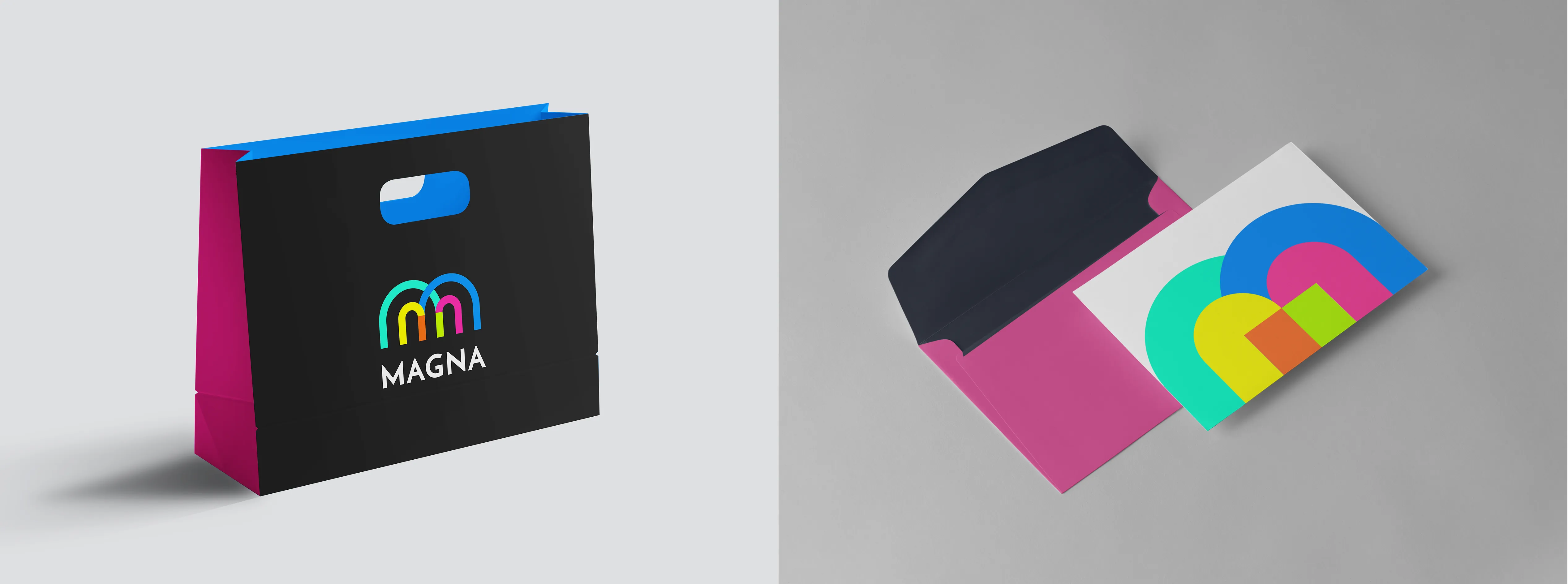

The new color palette is a bold and vibrant fusion of energy and creativity. The combination of electric blues, vivid aquas, and striking pinks and oranges creates a sense of excitement and innovation. A bright pop of yellow adds contrast, reinforcing a fresh and engaging visual identity. This palette is designed to evoke a sense of movement, playfulness, and modernity, making it ideal for a brand that stands out with confidence and originality.
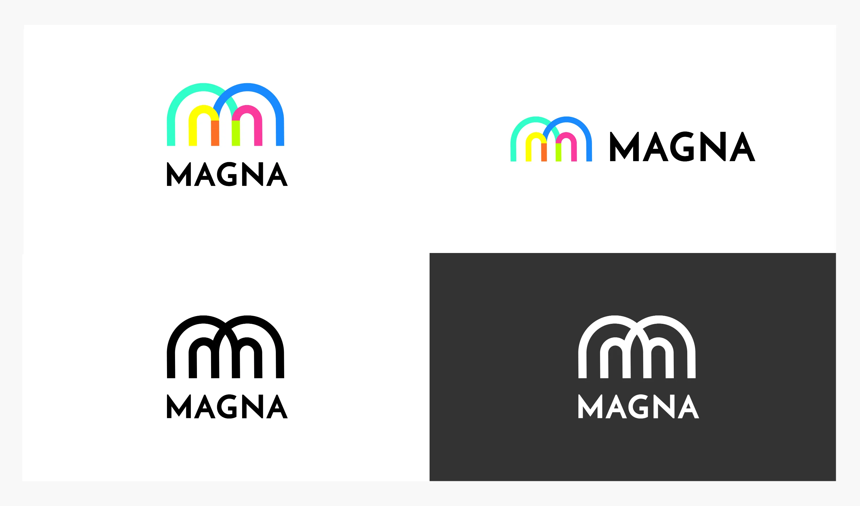
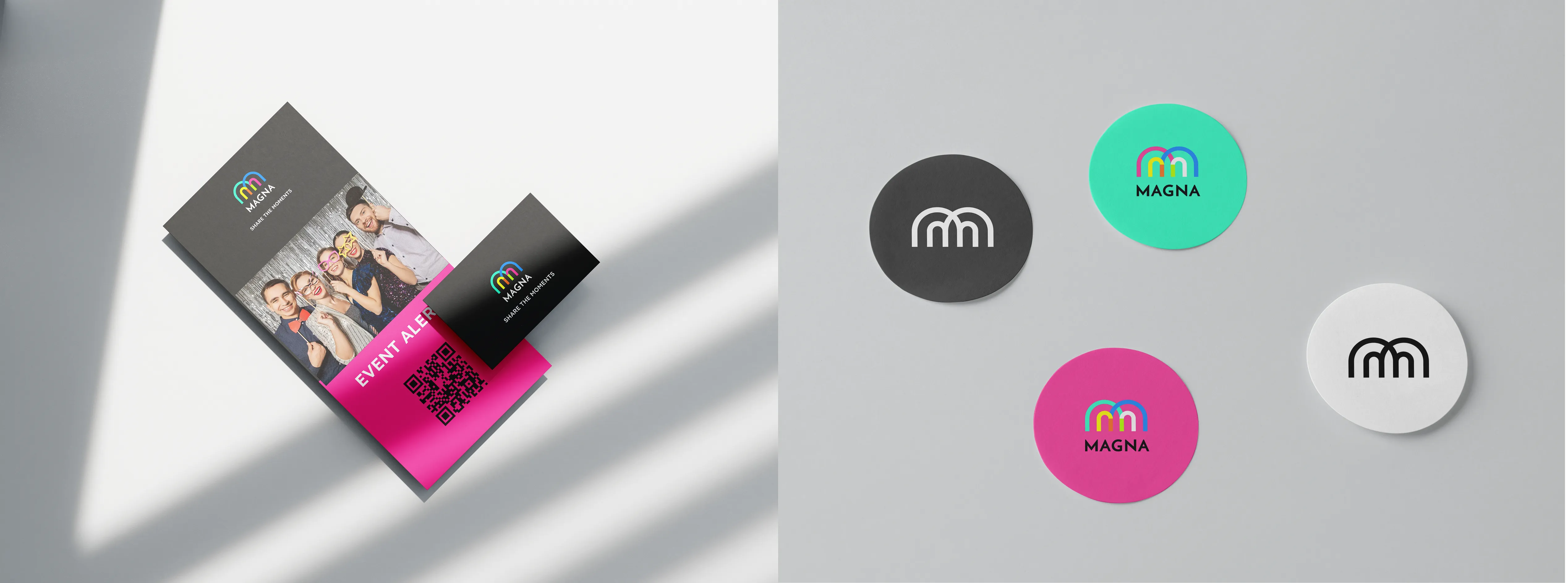
The Magna logotype is designed around two magnet shapes seamlessly merging to form the letter "M," symbolizing both connection and attraction. This design also reflects Magna’s core concept—capturing fun moments and turning them into refrigerator magnets that guests can take home as lasting memories from the event. This symbolic representation not only reinforces the essence of connection and attraction but also embodies the core identity of the MAGNA brand.